Video prompt
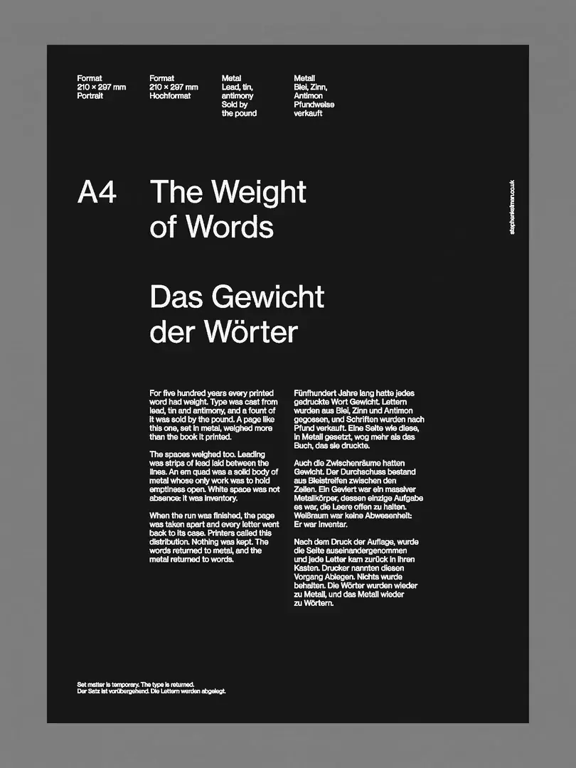
Create a 9.6 second portrait kinetic typography video in the exact 3:4 composition of the supplied first frame. Use that image as the opening frame. Keep the full charcoal black poster inside its broad medium gray surround, with the same straight edges, margins and flat front view. Preserve the four small information blocks near the top, the separate A4 label, the two line English title, the two line German title, the two narrow body columns, the tiny lower left footer and the thin vertical right edge label. The white typography should retain its original size, alignment and spacing until its own turn to move.
CAMERA AND FIXED SURFACES
Lock the camera for the entire shot. The gray surround, poster corners and black paper are stationary screen anchors. There is no pan, tilt, zoom, perspective change, paper bending or moving light. The movement takes place only in the pale letterforms. Treat the image as flat printed graphics being affected by downward gravity, not a physical sheet falling through a room.
MOTION SEQUENCE
Approximately 0 to 1.5 seconds: hold the complete legible layout still, giving the viewer time to read the headings. Around 1.5 to 3 seconds, the small upper information blocks begin to lose their firm printed shapes. Individual white strokes elongate vertically and shed fine falling strands. Their upper positions gradually empty as pale fragments travel straight down through the black field. The larger headings remain more legible during this first stage.
Around 3 to 5 seconds, the A4 label, English title and German title follow. Let parts of the letters briefly remain recognizable while they are pulled downward into narrow luminous streaks and granular threads. Stagger the collapse across columns and across individual glyphs; do not lower the entire layout as one rigid block. Earlier trails pass in front of the lower typography while that lower typography still holds its printed shape. The cascade progressively exposes clean black space from the top downward.
Around 5 to 7 seconds, the two dense body text columns break down into a much fuller white cascade. The lower footer and vertical side label also lose their strokes and drain toward the bottom. Fine vertical filaments, uneven bright clumps and grainy letter fragments overlap into a dense falling veil concentrated in the lower portion of the sheet. Fragments accelerate gently downward, remaining constrained to narrow columns rather than exploding sideways. Any faint trails passing below the paper edge disappear without changing the gray surround.
During the final portion, the last white threads leave the lower edge. By about 8 seconds the poster is an empty black rectangle inside the same gray surround. Hold that empty ending through 9.6 seconds. No rebuilt title, reverse motion, fade to a different composition or forced return to the opening.
RENDERING
Keep the restrained white, charcoal and gray palette. Letter trails are delicate, fibrous and slightly granular, with a mixture of bright cores and dimmer falling traces. Preserve the original flat editorial appearance wherever type has not yet moved. The existing typography supplies all visible marks; add no new words or symbols. If audio is required, use only a restrained original texture, not a copied source soundtrack.
Negative prompt: moving camera, zoom, rotating page, paper fold, rigid scrolling text, sideways explosion, bouncing letters, new captions, extra titles, color glow, smoke cloud obscuring the whole frame, permanent light trails, morph into a face, shifting margins, gray background moving, rebuilt poster at the end, interface elements or watermark.
Prompt details and source
Motion prompt reconstructed from the source clip. The opening frame is included. Generated reproduction and source soundtrack recreation have not been verified.
Read cover image prompt
Create a static portrait typographic poster, aspect ratio 3:4. A flat charcoal black rectangular sheet sits inside a broad, even medium gray surround. Keep the full sheet visible with approximately 8 percent margin at the sides and 6 percent at the top and bottom. All typography is warm white, in a plain Swiss grotesk sans serif with normal weight and restrained spacing.
Within the black sheet use a precise asymmetric editorial grid. Place four tiny stacked information blocks across the upper left half, each three or four short lines. Around one quarter down the sheet put “A4” in its own narrow left column. Align the main heading to its right on two lines: “The Weight” and “of Words”. Beneath it, aligned to the same left edge, place “Das Gewicht” and “der Wörter” on two lines. Keep generous black breathing room around these headings; do not center them.
Below the headings add two narrow columns of much smaller editorial type. Use this original paragraph as the body copy: “A letter begins as a shape. Set beside another, it acquires rhythm. On a printed page, the spaces carry as much weight as the marks. Each line balances density and silence. A small shift can change the whole reading.” Repeat it only as needed to create compact, uneven paragraph blocks of equal visual density. A tiny two line footer sits near the lower left corner. Add one very small vertical label near the right edge. Crisp flat print, no illustration, no shadow, no simulated animation, no decorative frame beyond the gray surround.
Read source text
Source caption: “The Weight of Words”
Black editorial typography poster with The Weight of Words and small white text arranged on a precise grid. Get the video prompt and first frame to adapt in Clico Web.
First frame reference
 Download first frame
This frame is included when you continue to Clico Web. You can replace it there.
Camera: Locked front view. The gray surround and black sheet stay fixed while the white letterforms stretch and fall down the page.